

I’ve found it largely to be the case that people who work on products (PMs, Designers, Researchers, Devs, Content, etc.) want to have more clarity on metrics but struggle to do so.
What's helped me over time is to think about metrics like individual pieces to a puzzle. My goal is to figure out how these pieces fit together as a puzzle, but frequently, no one really knows what the puzzle looks like—especially the “the business” or executives.
What's also helped me is to work backwards. Business metrics are typically pieces that already exist, so part of the puzzle is there. I work with my cross-functional partners to 1. create metrics we can directly influence as the makers of the products, and 2. figure out if/how they connect to those business metrics. It’s finding the “fits” of the puzzle pieces.
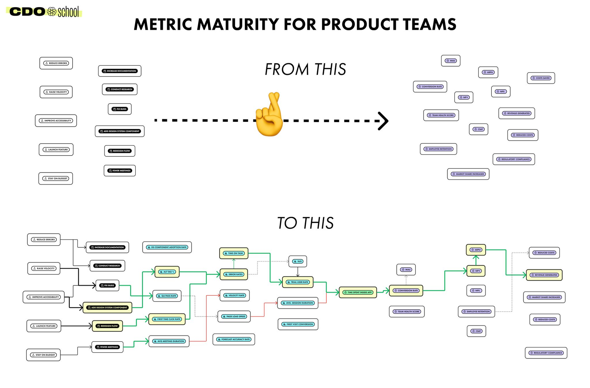
At the start, it often looks like a bunch of random puzzle pieces.
Some of the pieces are metrics (examples):
- CSAT
- NPV
- ARU
- Conversion Rate
- Time on Task
- Error Rates
- Alt Tag %
- Avg Time Spent In App
- Trial User Rate
Some of the pieces are goals and actions:
- "A new Design System component"
- "Improve Product Accessibility"
- "Fix Bugs"
- "Raise Quality"
Members of the product team have puzzle pieces, but struggle to understand how they fit as a puzzle. It's a classic chicken and egg problem.
When we start to map the relationships between metrics (thinking about cause and effect), post-mapping looks like something like this:
Improve Accessibility (goal) -> Create New Design System Component (action) -> Alt Tag % (metric) -> Error Rate (metric) -> Time on Task (metric) -> Trial User Rate (metric) -> Time Spent in App (metric) -> Conversion Rate (metric) -> NPV (metric) -> ARPU (metric) -> Revenue (metric).
After seeing how the pieces might fit together, that's when basic statistical analyses like Correlation or Linear Regression help them calculate if there are, in fact, relationships between metrics.
IMO, the hard part is explaining this in a way that 1. makes sense to a wide range of individuals, and 2. compels them to do this.
What's helped me do this hard part is having a partially filled-out map that has the metrics people care about and completing more of the map with product partners, so we're all on the same page. Once we complete that map and run some basic statistical analyses, we have more credible arguments for if/how the work that goes into making products translates to business goals.
Truthfully, not every exec is convinced, but at least we know we're making more credible decisions as a team. If an exec loves NPS, no matter what the data says, it's not on us to adult for them. We can hold our heads high and know we're doing a good job.


